What kind of media institution might distribute your media product and why?
A similar magazine to mine would be the ‘NME’ magazine as they have roughly the same age target audience as me ( when i asked me audeince in my suvrey which magazine they brought the most this was the most popular)

and this is also a rock magazine so whilst I was making my magazine I did a lot of research on the feedback that this magazine was getting so see what I could do to improve mine. An example of this was that the audience thought that NME attracted more audience by advertising lost of popular rock bands on the front cover that are in the magazine that have been reviewed so on my front cover I used this as an idea for myself. I think that the similarities between my magazine and NME are that we both have a target audience of more men than ladies. NME is published by IPC media and have a lot of products that are sponsoring them; I could have improved my magazine by making a sponsor for it so that there is more advertising for my magazine. NME’s readers have said things like the magazines are full of facts and information about bands that they would want to read and it is very trustable. In my contents page I have said that there will be a lot of different bands and their stories and reviews inside so I hope that the two magazines are the same in that way. Another magazines that reminds me of my own would be the ‘KERRANG’ I think that my magazine has the same sort of vibe as this as we are both using our colour scheme in the same way as adding the colours into our pictures by at the same time still having a lot of black and white in the magazine so the colours that are used stand out a lot more.


Who would be the audience of your media product?
The audience for my magazine was from around under 16-19 years old, I made this my target audience because im around this age so I would be able to no what people my age would like to see in a rock genre magazine. Also in my survey the people that would be interested were around this age. My target audience should also be fans of rock music as these are the sort of bands that are being advertised.

How did you attract/address your audience?
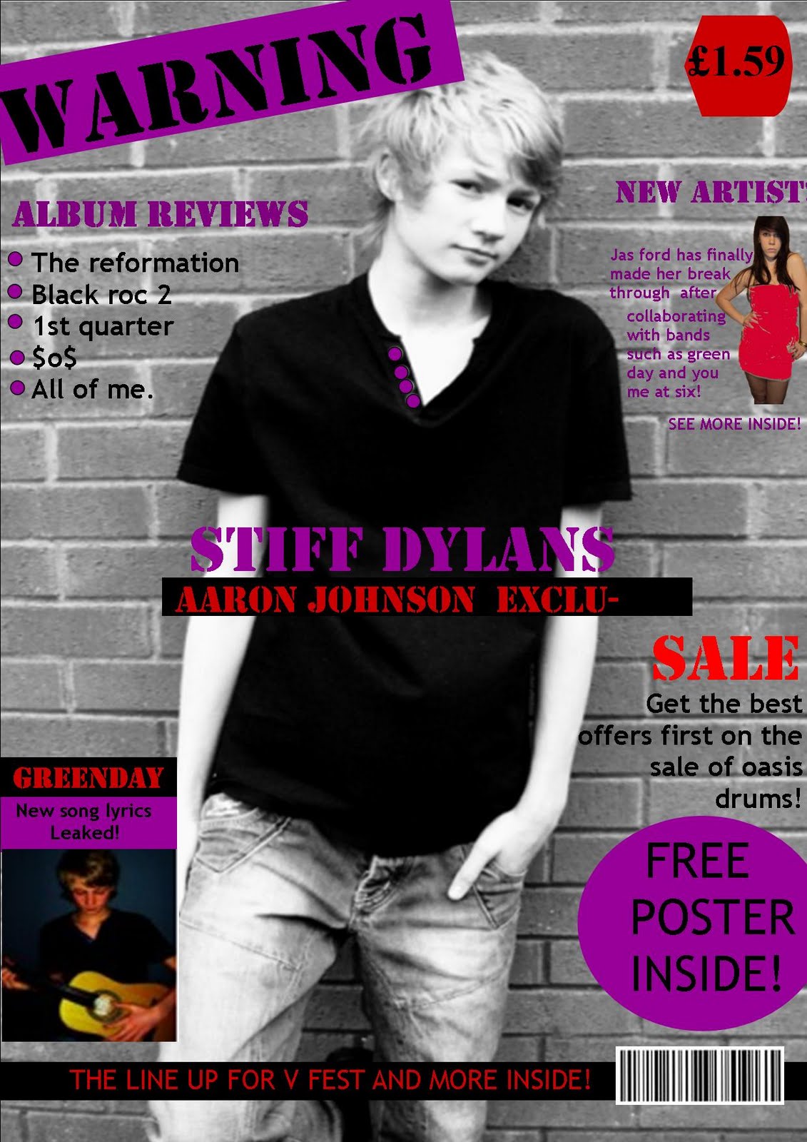
Before making my magazine I created a survey to ask my target audience on the things that they would expect from a magazine and what they would like to see. From this survey I had found out the colour schemes that my target audience would prefer and what colours would catch there eye if they were looking for a rock magazine. The survey showed that the preferred colours were dark colours with bright colours that stood out on them and the most popular colours where black red and purple, so when making my magazine I used these colours on all of the pages and also edited the pictures so these colours were incorporated into them, for example on my front cover picture I had changed the buttons on the boys t-shirt to a purple colour so they stood out with the text around it as it was a black and white picture. In my survey when I asked about the type of article that my target audience had wanted and the majority of the votes were for a band related interview which is what I based my article around. My target audience were around 16-19 so in the article I had used I based the interview on a young band and most of the questions and topics that we talked about were things that people in everyday life could relate to. An example of this was the questions about being worried about the future. My target audience was for both women and men so as I had my front cover model as a boy I had added a new girl singer onto the front cover so that this would also attract girls to the magazine. Also on the left hand side of my magazine I have advertised the magazine by some rocks bands that are inside so nay fans of these rock bands will be tempted to look inside. The most eye catching thing about the magazine that address’ my audience the most is the title of the magazine as it’s a rocky sort of text and which the purple back ground I think it stand out from other magazines of different genres. When making my magazine I has also used the layout to attract my audience by using the route of the eye and the hot spots to my advantage by putting the most interesting information in these spots or using a brighter colour that would stand out more. And the law of thirds, this is one of the reasons to why my double page spread is laid out in columns.


What have you learnt about technology’s from the process of constructing this product?
In the making of my magazine I have had to use blogger to store my work on the internet which I have never used before, by doing this I have had to save the work that I have done as an image to upload it to, www.blogger.com or www.scribd.com to link some of my work to the blogger web space so it can be viewed and marked. I found that using this was a lot easier to keep all of my work together in one place were I can see the comments for what I need to improve. On the computer I also had to use a lot of different programmes to create the magazine itself, I had to use Microsoft word 2003 to type up my evaluations on my work and to evaluate other work and to write up my draft for my double page spread. I also have to use Microsoft publisher to make the magazine its self, this helped me to set out the layout of where everything was going to go on my front over and contents page due to there being lots of drafts to look at and help me create my own and move everything around to try out new layouts. Using publisher on my double page spread helped me to place my text and pictures exactly where I wanted to and to put different back grounds on and overlap text and pictures, this has improved my design skills as I had to move everything around to get it to a place that I was happy with It being in but I still roughly stuck to my draft layout. Using publisher for my front cover allowed me to place the picture behind the text as if it was the background to start with and after editing pictures it was a lot easier to add them into the page. Before making this magazine I have also never used the editing programme fireworks before as I had to with my pictures. This programme has let me cut pictures out of a background like I had wanted as they weren’t how I had necessarily wanted them when I took them, also using this programme it helped me to improve the colour scheme of my magazine as it allowed me to edit the colours of some of my pictures, for example I had edited the buttons on the top that the boy Is wearing on my front cover to fit in with my colour scheme a lot better and change the colour of the dress the girl in the top right hand corner is wearing as the dress in reality was cream so I had changed it to a red. Fireworks also allowed me to play around with the affects of the picture until I had it how I had wanted it. So on my contents page I had adjusted the pictures colours to make them black and white, this has helped to improve my presentation skills. To create a different affect on the texts I had used paint to see what different unusual texts I could make but in my survey the audience had voted against these texts so they were not used. To take my pictures I had used a new Panasonic digital camera with a face tracker on, this helped a lot when I was taking the pictures for my double page spread as at the time the two boys were playing there guitars so when the photos had came out they were not blurred by the movement of there hands moving up and down. Taking the pictures outside was a lot better as well because this camera automatically adjusted its flash and light intake when exposed. After taking the pictures I had to load them on to the laptops with a lead but I had done this before so it was no new technology. But when editing the photos my perception skills had improved as I had to realise small details of the photo that would move peoples eye away from the route of the eye so the pictures would have to be retaken or edited rightly to look right with the back setting of the front page or to fit in with a contents page as having a fly in one of the pictures taken outside would have attracted peoples eye as its something that is to expected to be there.

Looking back at your preliminary task, what do you feel you have learnt in the progression from it to the full product?
Whilst creating my preliminary task I didn’t worry about the way I was taking my pictures and how it was presented, I didn’t think about the colour scheme either I just put it all together, the front cover was very plain and didn’t really catch your eye as there was very dark dull colours on it. My school magazine was also very boring compared to my music magazine especially on the contents page as the pictures are just showing small pictures with noting really to look at were as in my final magazine the pictures are more focused on something. I feel that I have learnt how to present my work a lot better and that it takes a lot more preparation which the photos, and for my preliminary task the front cover picture didn’t really have a back ground to make the text and photos stand out a lot more. Also having a background like my music magazine has makes it look like there is a lot more information inside then in the school magazine which makes it look very boring. On my preliminary task there wasn’t a specific target audience to set it for so it was just a general magazine so not many people would be attracted to it were as on my music magazine there was a target audience so it was attract to a wider variety of people so a lot more people would buy it. I think I have improved on my design a lot better as the colour scheme is more obvious the whole way through the magazine and my pictures catch your eye a lot more, and help tell the story on my double page spread. The pictures on my contents page were like teasers so you knew what was coming in the rest of my magazine in my final magazine but in my preliminary task the pictures weren’t drawing you into wanting to look at the rest of the magazine.


How does your media product represent particular social groups?
my media magazine appeals to people that are fans of rock music, these people may be classed or sterotyped into a social group of 'emos' or 'goths' i think that my magazine represent this social groups because of the colours that i had used, also in my survey for my target audience i has asked what other magazines of this genre that they had liked and the most popular magazine that they had said we the NME magazine so i researched into there target audience and instituations work that they had publisised on the internet for what there audiences where mostly represented by and i had found that certain bands had been sterotyped with certain social groups. An example with this and my social target group was groups like you me at six and greenday which was one of the main bands there where regually shown in the NME magazine. To reprsent what type of magazine this is aswell i had made a title that represents this sort of social group as this social group is seen to be more grungy. As well as the font that i used the colours where colours that are for this particular social groups as most bands that this group are fans of like to wear dark colours with bright colours or others to make them stand out.

These are the colours that i had choosen for the colour schemes of my magazine and the reasons why i had liked/disliked them and this was also based on others opinions in my target audience, and then the black red and pruple colour scheme was chosen to represent the social group and target audience.
In what way does your media product use, develop or challenge forms and conventions of real media products.
i had researched alot into other magazines and the main ones where kerrang and NME becuase this was the closest two magazines that shared the same target audience as me. which the professional magazines i had found that:
- the layouts where spaced out so each part of text had a particular place.
- the main cover line was the picture on the front cover.
- the tag lines on the front cover had atleast one picture of another artist on.
- the masthead was large and stood out.
- the colour scheme had all matched with the text.
I had thought that in my front cover i has used these points to develope my work becuase i has tried to use as much space as i could and spaced everything out, aswell i had added two other cover lines on the front cover that had pictures added into it aswell. the main boy on my front cover was wearing black and white but to add him into the colour scheme more i had edited his buttons on his shirt to make them purple and fit in with the colour scheme.

some of the conversions that i had found on contents pages where similar to some of the ones i had found on the front cover these where:
- all of the text was very organised.
- there where pictures to the most appealing and important texts in the magazine.
- the colour scheme still fit in with the front cover.
- there wasnt alot of information but what was there was important.
- some had editors letters.
im my product i had tried to do the same as the other magazines on the market that had made strengths to there contents page, these where things like carryig on the colour scheme. i also spread out alot of the information and added some images so it was less boring, all of the page numbers where only down one side so if your just needed to no where things where then thats all they had to look at. i dicided to add an editors letter into my contents page aswell as i think that this helps draw the audicne in more and it targets the audience alot more aswell.

the convertions that i had found across different products for double page spread where:
- more than one image was used.
- they stuck to the colour scheme well.
- there was usually a main image to go with the text.
- a clear and bold title.
- a teaser under the title.
i think that i had made my double page spread well to fit in with these conversions because again i had used the colour scheme and had a main picture that had related to the article and wasnt the same image that was on the front cover or the contents page. Aswell as this i had added a teaser/tag line under the title of the spread because this gave a brief summary of what they are about to read. there was also a mis of font sizes to show what was more important in the article and what was quoted that they had personally said.